Section Heading
Section Heading
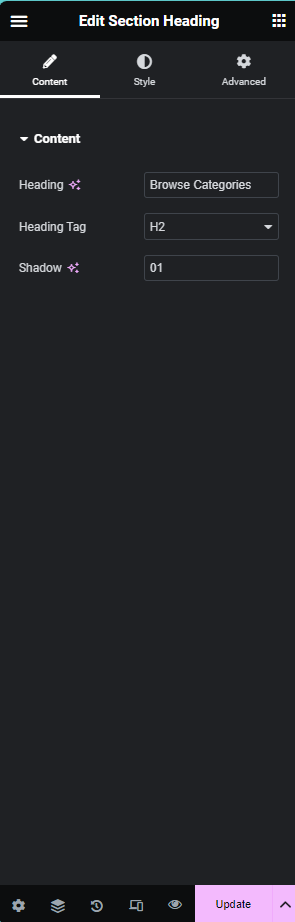
Overview
The Section Heading Widget in Elementor provides a dynamic and customizable way to add headings to your sections. It comes with multiple controllers, allowing you to have fine-grained control over the appearance of the heading. The main components of the Section Heading Widget include:
- Heading Name: The main text content of the heading.
- Heading Tag: The HTML tag used for the heading (e.g., H1, H2, H3).
- Shadow: Adding a shadow effect to the heading for a more visually appealing design.
Controllers
-
Heading Controller: This controller allows you to set the main content of the heading. You can input your desired text to display as the heading.
-
Heading Tag Controller: The Heading Tag Controller lets you choose the HTML tag for your heading. This is essential for SEO purposes and helps structure the content hierarchy. Options include H1, H2, H3, and so on.
-
Shadow Controller: The Shadow Controller enables you to add a shadow effect to the heading, enhancing its visibility and creating a sense of depth.
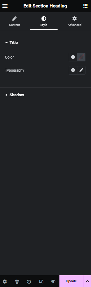
Style Tabs
-
Title Color: In the Style Tabs, you can customize the color of the heading text. This allows you to match the heading with your overall design theme or create visual emphasis.
-
Typography: The Typography settings in the Style Tabs provide options to customize the font style, size, weight, and other text-related attributes. This ensures that your heading aligns with your design preferences and maintains consistency across your website.
-
Shadow: Under the Shadow settings in the Style Tabs, you can further customize the shadow effect applied to the heading. Adjust parameters such as color, and offset to achieve the desired visual impact.
Frontend Preview

Content and Style Controls